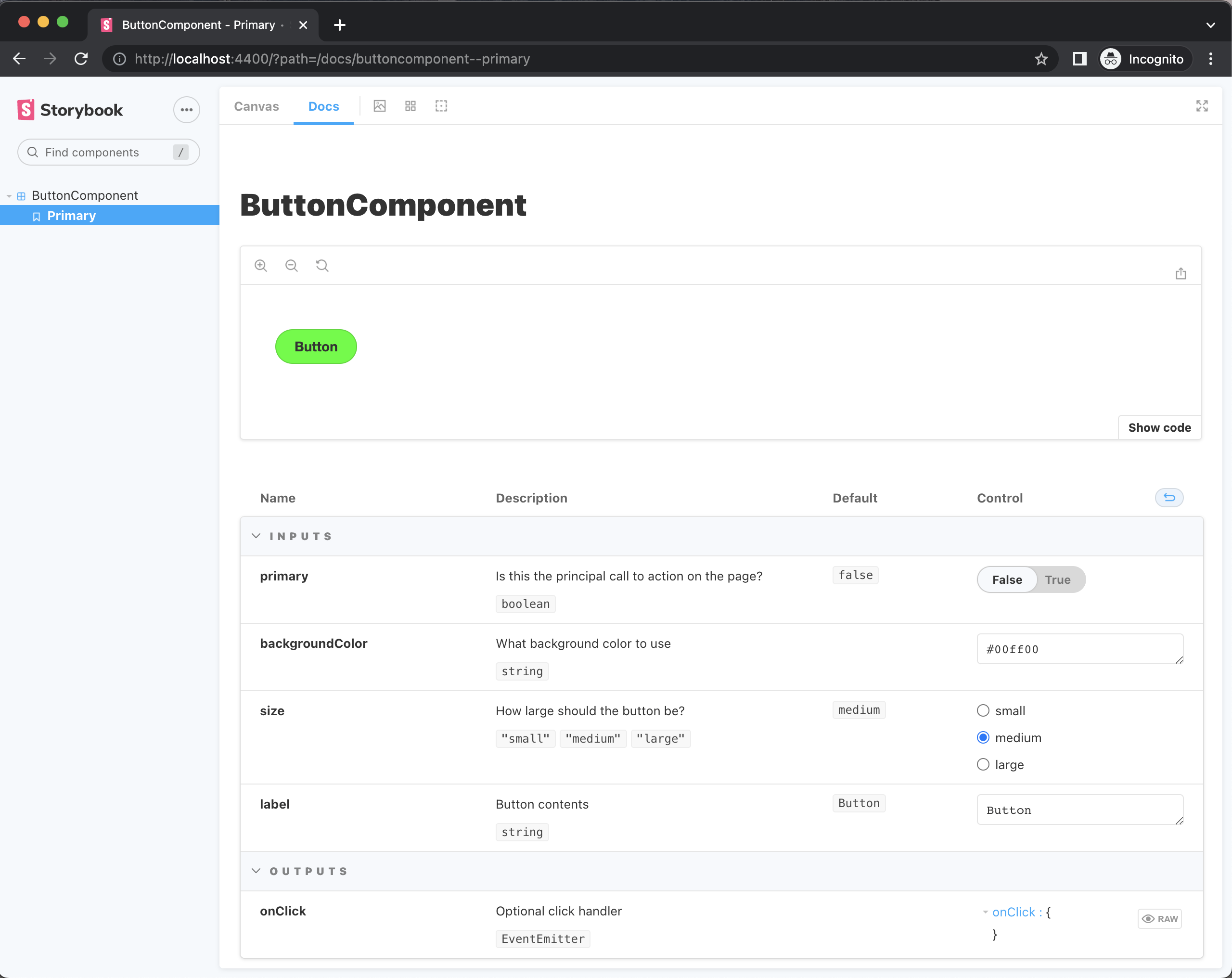
This documentation page contains information about the Storybook plugin, specifically regarding Angular projects that are using Storybook.
Set up Compodoc for Storybook on Nx
What is Compodoc
Compodoc is a documentation generator for Angular applications. You can use JSDoc comment blocks above your components, directives, and other Angular constructs, to add documentation to the elements that you want. These comments are used by compodoc to generate documentation for your application. As is noted in the Compodoc documentation, "Compodoc uses the Typescript AST parser and it's internal APIs, so the comments have to be JSDoc comments". You can read more about the JSDoc tags that Compodoc supports here.
How to use Compodoc in Storybook to write documentation
In Storybook, it makes sense to add explanatory comments above your @Inputs and @Outputs, since these are the main elements that Storybook focuses on. The @Inputs and @Outputs are the elements that you can interact with in the Storybook UI, the controls.
Let's take for example an Angular component - a button - that has an @Input for the size of the button. In Compodoc, we could describe this input as follows:
/**
* How large should the button be?
*/
()
size: 'small' | 'medium' | 'large' = 'medium';
This comment would result in the following documentation in Compodoc:

If we add a description and a default value to each of our component @Inputs, we will end up with a full documentation page. See a full example of the button component here. The generated documentation of this example will look like this:

When you run Compodoc, it will generate a documentation.json file. Storybook will then use that file to render the documentation in the Docs tab.
How to enable Compodoc for Storybook
The main things that you need to do are:
- Include the component files in the TypeScript compilation for Compodoc (or any other files that contain your Compodoc documentation).
- Use
compodocto generate adocumentation.jsonfile. - Tell Storybook to use the
documentation.jsonfile to display the documentation.
Let's see how you can do that.
NoteThis guide assumes that you have an Angular project with Storybook configured in your Nx workspace. If you do not know how to set these up, please read about setting up Storybook for Angular on the Nx documentation website.
1. Install the necessary packages
First we need to install the necessary packages:
yarn add -D @compodoc/compodoc
or
npm install --save-dev @compodoc/compodoc
2. Include the component files in the TypeScript compilation for Compodoc
When you are using Compodoc, you need to create a tsconfig file, and in the include array you need to place all the files that you want Compodoc to include in its compilation. Compodoc suggests to add a tsconfig.doc.json to do that. Then, when running compodoc you can use the -p (or --tsconfig) flag to specify the path to that file. See all the options that Compodoc supports here.
In the Storybook case, Storybook has the --tsconfig option prefilled to point to the .storybook/tsconfig.json file. As is noted in the Storybook schema for the Angular builders, "Options -p with tsconfig path and -d with workspace root is always given.". What this means is that you can add the paths to the component files (where Compodoc will look for JSDoc comment blocks) in the include array of the .storybook/tsconfig.json file. This is the file that Storybook will use to compile the TypeScript files, and it will also be the file that Compodoc will use to compile the TypeScript files.
In your project's .storybook/tsconfig.json file, in the include array, add the path to the component files (eg. "../src/**/*.component.ts"). For example, if you have an application called web, the file apps/web/.storybook/tsconfig.json will look like this:
{
  "extends": "../tsconfig.json",
  "compilerOptions": {
    "emitDecoratorMetadata": true
  },
  "files": ["../src/polyfills.ts"],
  "exclude": ["../**/*.spec.ts"],
  "include": ["../src/**/*.stories.ts", "../src/**/*.component.ts", "*.js"]
}
Important! If you are importing stories from other places, and you want the docs for these stories to be generated, too, you need to add the paths to the other components in the include array, as well!
For example, if your stories paths look like this:
"../../../**/**/src/lib/**/*.stories.ts"
make sure to also include
"../../../**/**/src/lib/**/*.component.ts"
for the components to be included in the TypeScript compilation as well.
This applies in cases where, for example, you have one single Storybook for your whole workspace, where you import stories from all the projects. In that case, you need to import all the components as well!
3. Enable compodoc and configure it
a. Set compodoc: true
In your project's project.json file (eg. apps/web/project.json), find the storybook and the build-storybook targets.
In the options you will see "compodoc": false. Change that to true.
b. Set the directory
Storybook has preconfigured compodoc to generate a documentation.json file at the root of your workspace by default. We want to change that, and keep the documentation file project-specific. Of course you can change that later, or as you see fit for your use case. But let's keep it project-specific for now.
In your project's project.json file (eg. apps/web/project.json), find the storybook and the build-storybook targets. Below the "compodoc" option, create a new option called "compodocArgs which contains the following: ["-e", "json", "-d", "apps/web"]. This means that the exportFormat (-e) will be json and the output directory (-d) will be apps/web (change that, of course, to the directory of your project).
Let's see the result for our web app storybook target, for example (in apps/web/project.json):
    "storybook": {
      "executor": "@storybook/angular:start-storybook",
      "options": {
        "port": 4400,
        "configDir": "apps/web/.storybook",
        "browserTarget": "web:build",
        "compodoc": true,
        "compodocArgs": ["-e", "json", "-d", "apps/web"]
      },
    },
4. Let Storybook know of the documentation.json file
In your project's .storybook/preview.js file (for example for your web app the path would be apps/web/.storybook/preview.js), add the following:
import { setCompodocJson } from '@storybook/addon-docs/angular';
import docJson from '../documentation.json';
setCompodocJson(docJson);
Now run Storybook and see the results!
Now you can run Storybook or build Storybook, and documentation will be included. Just check the Docs tab!
nx storybook web
and
nx build-storybook web